Website Navigation: 10 Easy Tips to Improve

What Is Website Navigation? It is the process of moving between different web pages, page sections, or documents. Without proper navigation, it's easy to become lost and frustrated while trying to find the required information on a website.
Users should be able to easily find content such as pages, products, and services. Otherwise, if everyone is in chaos, they won't be able to find what they need and will quickly leave your site.
What Makes Site Navigation Good?
Without good website navigation, even a small website can become hard to navigate and confusing. Good navigation design makes it easy for website visitors to find what they need when they need it.
Imagine yourself visiting a bookstore. You don’t want to get lost in a maze of shelves, and you don’t want to see books you aren’t interested in. You want to quickly find the new bestseller that has everyone talking. That’s what good website navigation should do for your visitors: take them directly where they want to go, without any hiccups along the way.
Website Navigation Menu
The menu is a set of navigation links that appear in the header, bottom, or sidebars of your website and helps people find the information they need on your website.
Website navigation menu plays a key role. It should be easy to find, should indicate what visitors will find when they click a link and should be designed in such a way that everyone can use it without difficulty.
Appearance, Behavior, and Structure
There are three aspects of a navigation menu: appearance, behavior, and structure. The appearance comes first because the menu is the first thing the visitor sees when he (she) lands on your website. The behavior of the menu determines the usability and should facilitate user interaction.
In many cases, there is a lot of room for improvement. Let's look at the navigation element you have on your current website. It may not be terrible, but it could definitely be better.
In this article, I’ll share some recommendations on how you can design a really attractive and user-friendly website navigation menu easily and without spending a lot of time using the online application - Dropdown Menu Generator.
Add Icons
Icons created a revolution in the web design world - they simplify navigation, maintain data integrity and increase website usability.
Icons make website navigation easier and quicker for users. When you’ve been surfing the web for a while, you learn what icons to look out for at each point. Most commonly, these are the homepage icon, the search icon (a magnifying glass), and the email icon. The best icons to use are those that are universally recognized.
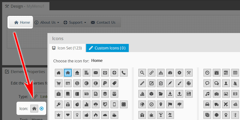
The Menu Generator includes a collection of 120+ most popular icons. Also, you can import your own icon set as described in this blog post.
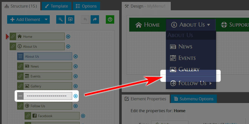
Use Arrow Indicators
In almost every website navigation bar, some items have submenus. The arrow element is used to indicate that the parent item holds a submenu.
Properly placed submenu arrows improve both the usability and information architecture of the navigation bar.
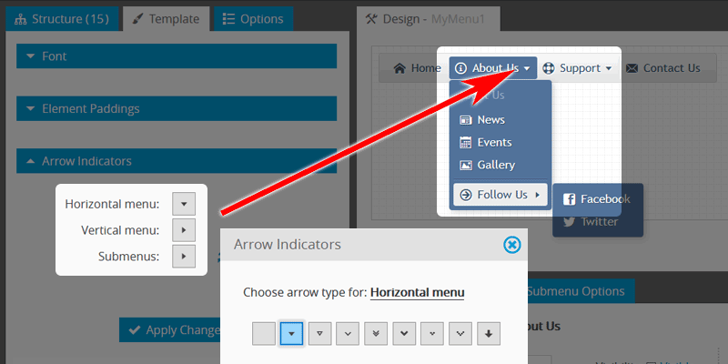
The Generator includes a set of icons that you can use as arrow indicators. You can choose arrows for the horizontal bar, for the vertical bar, and submenus.
Choose Readable Font
Creating an attractive website navigation bar is possible by using good typography. The key is by using friendly style fonts that make the navigation bar more readable.
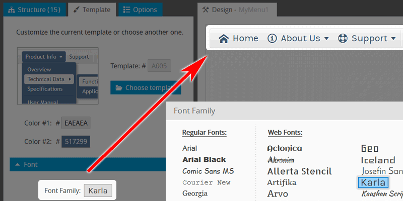
Use the fonts that are included in the application collection. It offers more than 60 of the most popular web fonts, so you're sure to find something that suits the design of your website.
Use Contrast Colors
The choice of color is an important point. In graphic design, we call this color contrast. It refers to the difference in the color values between two elements.
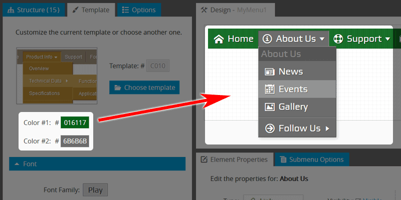
The application includes a set of ready-made templates. Each template can be customized with two colors: primary and secondary. Choose colors that will make your menu contrast, clear, and sharp against your website background.
Use Images
Have you ever visited a website and wondered why the menu or navigation bar is so appealing to your senses? A pretty menu with images is an effective way to enhance the user experience and promote your products or services.
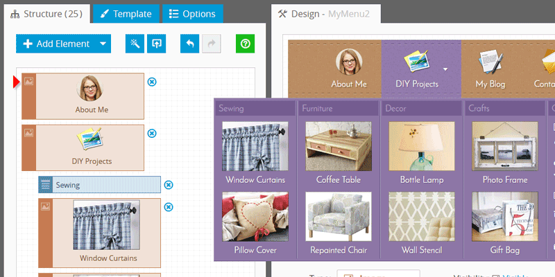
You can easily upload an image to any element. This blog post describes in detail how you can load pictures in the menu and make it more visually appealing.
Add Separators to Group the Elements
Separators are a great way to group the different elements you want to show separately from each other, or information that flows together and should be separated by groups.
Add Separators to make the website menu elements easier to understand by breaking them into distinct sections.
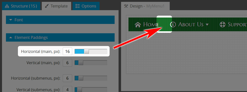
Add Paddings
If you do not use paddings inside the menu elements, it can make the labels less readable or even unreadable.
Leave space between the website navigation links. That space helps a person to focus on just one element at a time.
Make the Menu Responsive
Once your website is accessible to browsers on mobile devices, it's time to make sure that the navigation elements are too. If the navigation menu on your website doesn’t display properly on mobile, you could potentially lose the vast majority of your customers.
In the application, to make your navigation bar responsive, enable the “Responsive” checkbox under the “Options Tab”.
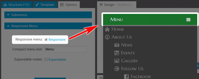
Once you activate the responsive feature, the entire navigation bar will get resized as per the device you are using.
Use Fade Effect
A popular way to improve user experience is to use the fade effect. This makes submenus fade in and out, rather than appearing or disappearing suddenly, making your website menu feel instantly more friendly and welcoming.
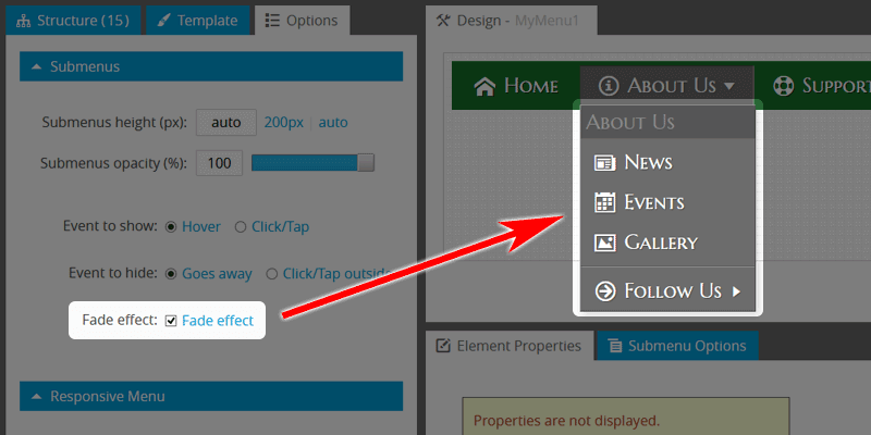
To enable it, simply check the corresponding checkbox. You don't need to adjust the effect duration - the Menu Generator uses the optimal value.
Avoid Long Submenu Lists
Long lists are hard to read and even harder to use. Visualizing information in columns instead of a list keeps your content concise, clear, and easy to read.
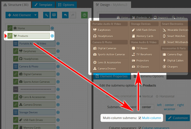
With the help of the application, a long submenu can be split into several columns. Just enable the "Submenu columns" option, which will reconstruct the drop-down list to a multi-column element. Also, you can add separator items between each column to make the layout more visually appealing.
Summary
The objective of website navigation goes beyond the simple function of enabling a user to move from one point to another. Navigation is a critical aspect of web design since it can either become an obstacle or make your site more usable and easy to navigate.
Website navigation is one of those things that should never be overlooked. Its job is to help your visitors easily move around on your site and find content that may interest them or help them achieve their goals.
After reading this post, you should now have a better understanding of website navigation. Thanks for reading, and if you have any questions or want to share your thoughts feel free to contact us.
Links